Thursday 27 March 2014

Sketches of face paint designs

I am taking a lot of influence from The Jester by Kirk Quilaquil. Primarily the face paint design. I have thought a lot about the designs and decided to sketch them.

At first I was thinking about the suits in a pack of cards and I saw that the design from Jester was very precise, it looked like it was done professionally. Therefore I kept to this generalisation. I really like the solid lines because it really stands out. However I dislike the suit logos because they don't flow with the lines.


Here I have experimented with very rough edges that blend in with the skin whilst keeping some of the similarities like make up around the eyes and mouth. The cracking of the face paint was influenced by the Joker played by Heath Ledger in the Batman movie 'The Dark Night'. I like this because its a little different and the crying face shows the opposite of how a jester or clown should feel. I feel that this is very controversial about entertainers. On the other hand I think that this may be to hard to achieve considering my own abilities and it struggles to reflect work of a researched accurately.


I am going to revisit using solid lines.


I really like this design. It follows three main aspects of the face including both eyes and the nose; it then seems to frame the lips in between the lines coming from the eyes. The lips and around the eye is also black. This design is very simple but it is very appealing because it sparks a reaction. It makes the viewer feel a little uneasy; possibly frightened. I am going to use this design on my photo shoot.

Flying Cards


I have an idea where a card would be thrown towards the camera and I would use a small aperture so that the thrower is only just out of focus and the card will be in focus. This means that I will have to use a fast shutter speed and I'll have to get perfect timing. An alternative is to use an infrared delayed camera trigger.

These transmit an IR beam that when broken it will trigger the shutter, the delay time should be adjustable so that all the subjects are in frame. The high end models have an adjustable beam area coverage and they also respond to other elements like sound, movement and light. The light sensor is similar to the slave setting on a flashgun. There are many videos and tutorials that can teach someone how to make an IR trigger using an Arduino, micro chips and resistors to adjust the delay time. 

However I will attempt to get the image without a delay trigger first so save the hassle of making one or buying one.

Wednesday 26 March 2014

Rezarta Shkurta

I can not find any personal information about this photographer even though Shkurta has a website and an official Facebook page. Looking at the types of images on her Flickr page she specialises in portraiture, fashion. A lot of them use specialist lighting and skilled digital manipulation techniques which make the images look very surreal.

 
In this image the model is bending the cards which create tension and they then pop out of his hands. The model looks very relaxed doing this which I hope to achieve because I have an idea of someone throwing cards. The image is also desaturated which makes the detail of the model and the flying of the cards stand out. The lighting looks like it’s a natural light source from the left of the image; I think this because of the gradual contrast across the image from left to right. There is also a black ring around the image which suggests that they used a normal sensor lens on a full frame camera or did it afterwards in edits.

This image has clearly been colour splashed. The colour splash however is really effective because it really makes this image stand out. When I look at the image I am immediately drawn towards the card and then I move to the face because of the lips and the density of the black around the models eyes. I then look at the dress because of the intensity of the blues and purples. The whole of the image is in detail, this means that Shkurta must have used a high f number. There also seems to be a lot of noise but I think that this works well because it blends in with the colours that Shkurta intended to use. I really like this image because of the intense colours and simple positioning of the model.

Tim Walker

For the last decade Walker has worked for Vogue magazine, producing work month by month. The characteristics of his work can be described as extravagant and romantic which is a reoccuring motif. He graduated in 1994 and worked as a freelance photographic assistant in London. Walker then moved to New York where he became a full time assistant to Richard Avedon. At the age of 25 Walker created his first fashion story for Vogue; since then he has gained many awards including ‘Isabella Blow Award for Fashion Creator’ and 'Infinity Award' from The International Center of Photography.


The main light source for this image seems to be behind the model which has then been reflected by the walls and disco balls. This has created a large contrast in tones across the legs, body, arms and face. However the reflection from the disco balls separate these shadows making the image more complicated than it actually is. The models leg seems to split this image into two parts; the lower part is very chaotic with light and shapes and the top half relies on one light source and doesn't excite the viewer as much as the lower half. The colours that have been used are very neutral however the red used on the models lips make her whole face stand out. This emphasises the the tones across her face and how it makes her expression very serious and dominating. These feelings are very overpowering and makes the viewer feel like they have an emotional attachment to it. The location that was used is very simply a corner of a room near a window. I like this because the light bounces off these walls perfectly to create the mood of the image.


 This image has used natural light from the huge window on the left, therefore there is a dominance of light on the left of the image and becoming slightly darker as you look to the right. The contrast in tone is very small. The blue of the dress matches the blue of the walls and I personally find this very calming because it makes me think of a summer sky. The dress also looks really delicate and majestic because of its length and the number of folds it as it falls to the floor. I feel that this relates to the design of the staircase. The positioning of the model on a spiral staircase really reflects Walker's romantic style because it looks like she is waiting for someone or something which is emphasised by the aged building. There are a lot of vertical lines in this image which I think leads you from the top of the image where the model is to the bottom where the dress is resting across the floor.

Annie Leibovitz

Annie Leibovitz is an American photographer born 1949 in Connecticut. In 1970 she took a job with the Rolling Stone magazine. After two years as staff photographer she was promoted to chief photographer and stayed with the title for 10 years. Her position meant that she could join The Rolling Stones on their 1975 tour. She developed her style of bold colours and surprising poses. She left Rolling Stone magazine to work for Vanity Fair. A magazine with a much wider array of subjects. The subjects ranged from presidents to literary icons to heartthrobs.


Leibovitz has used colour and positioning very effectively here because the red would connote danger or love. I think the bare skin that is shown from the model and the very thin legs and arms might show that she is actually weak and lifeless. The size of the dress shows that she completely material. She has nothing but the dress that makes her who she is. Lying on the grass is very simple and very bland which is the opposite of the dress and helps the dress to get a lot of attention from the viewers. The models body follows a line of the rule of thirds horizontally and the base of the dress falls down a vertical rule of thirds.


The lighting in this image is very dim and it creates a lot of shadows this may show that there are a lot of  secrets that are hidden. This is promenant in the main subject and in the group of people on the left. However the group on the right are well lit, maybe this shows that they are innocent and have nothing to hide. Since as the two groups are split up it may mean that they dislike each other; different families, a fight,anything could have split them up. The two models in the middle of them may be people who are trying to resolve the problem or prevent the fighting. The use of the lighting is very inspiring to me because it is very natural which is something I wanted to achieve in my images.

Rankin

John Rankin Waddell started his career with Jefferson Hack in 1992. They created the monthly magazine Dazed &Confused that gave emerging stylists, designers, photographers and writers a platform to start there own career. After this he was part of some major editorial and advertising campaigns for Nike, Swatch, Pantene and Dove. Rankin has made front covers for magazines such as Vogue and Rolling Stones. In 2001 the duo created AnOther which focused more on fashion, originality and distinction. AnOther man was produced in 2005 to match the rise in men's fashion popularity. His love of taking portraits has made him very renowned and popular with supermodels, celebrities and VIP's like the Queen and Gordon Brown. However he often takes on his own projects for example; Rankin Live. He would take an image of someone off the street to prove anyone can be a cover model every 15 minutes. He did this for 7 weeks and created over 1600 images for his exhibition.


This image looks like it has used mostly LED lighting from behind the model to illuminate the model. The use of reflectors would have been used both sides of the image however it looks like a more reflective surface has been used on the left side. This is quite important because it makes the very harsh lighting of the background become very soft across the models face. The models hair, make up and clothes are all blue and this is intensified by the mixture of the colours of the background. The line created by the shadows on the face is lying on a line of thirds which means that the viewer is automatically drawn towards the face and eyes of the model because they are the lightest part of her face. I find that the use of the make up on the eye lids to intensify colours is very effective and I may use this to intensify colours in my images.


This image looks like it was taken in the back garden of a foreign home. I think it is a warm country because of the cactus in the background; also the model is barely wearing anything even though it is clearly night time and directed light has been used. The light source is to the left side and is placed above the the cameras position. The stone paving has a similar tone to a lot of the clothes that the model is wearing and the skin tone of the model so it blends in. The pose, hair and make up that the model has is very professionnel however the clothes that are being worn are casual wear which fits in with the location but contrasts with the model. I am drawn towards the models face first because it is the only part of the image that is looking at the camera, the right hand of the model is also pointing straight at it and the left arm framing the head and hair. I then look down to the shirt and I follow the legs down to the feet.

Dr. Harold Edgerton

Edgerton born 1903 - 1990; was the first person to use strobe lighting and fast shutter speeds to capture rapid movement. the strobe would illuminate the subject in repeating and rapid bursts of light and make it easier for the camera to see it. this was very popular because it was the first time anyone would have seen still high speed objects ever before.

Here a bullet has been shot at a card from the side and it has ripped straight through it. Edgerton has used intense strobe lights to illuminate the area. This allowed him to used an extremely fast shutter speed  and capture the bullet. This is a documentary piece I think because this was a test of how far photography can be pushed to achieve detail at extreme speeds. The shadow to the right of the card is its own shadow and you can see where it has ripped. I appreciate this image because it is really hard to achieve and a lot of knowledge is needed to perform this task however I dont find it very inspiring because it is not related to fashion or portraiture.

Update:
I could use a fast shutter speed to capture a flying card since as I know someone who can throw cards.

Joanne DeCaro

Joanne DeCaro Afornalli is an event and portrait photographer from Italy and has worked with hundreds of up and coming clothes designers and worked for an artist interview magazine as a photographer and photo editor.


This portrait is very specific and it focuses on the make up that is being used. The colours are very bold and and stand out against the models face. It looks like a white bace layer has been used on the models face first in order to make the these shapes stand out. The lack of clothes suggests that this is all she is and its all she can think out. The cup being used suggests that the model drinks tea of coffee which gives people a caffein rush. This theory is supported by the models eyes being wide open taking every bit of information in. Her eyes is also linked to poker because you are always looking at other players to see there reaction. I think this image could have been made better if the models hair was styled to match the glamourous persona of poker. DeCaro has used a very intense flash infront and above the model; this has created a harsh contrast between the shadows and the light.

Kirk Quilaquil

Quilaquil was born in 1990, Hertfordshire, England. He is a freelance digital and physical concept artist/illustrator. Quilaquil has gained a BA Hons in Animation.


this is a digital art image of a portrait. Quilaquil has only used black and white to make this image. to produce tone in his image he has used mark making techniques like lines, crosshatching and overlaying. this gives the image a very sketchy feel to it which makes me appreciate his skills. the proportions of the  face, body and props used is all accurate. the viewer first looks at the heart shaped smoke and is lead through the image from there through to the face and hat; then down the back and shoulder. the most inspiring thing about this photograph is the subjects clothing. it is very casual and quite mysterious which often explains the environment that surrounds gambling.


This is also digital artwork and it is called The Jester. The use of expression is very effective because the female is very serious as if she is determined to win, however the bright colours, mask and positioning of the cards, roses and ribbon falling all connotes having fun. I really like this piece because of how much it contrasts with itself. This image shows the extreme fashion that could be linked to gambling and card tricks which I really like. If I am able to make/find clothing similar to this then I may be able to create some extreme fashion that is related to gambling. Her pose suggests that she is scared or nervous, this is because she is holding her arm suggesting she needs some support and protection. Her dipped head shows that she isn't confident or proud. Maybe she is ashamed to be dressed like this or ashamed to be in that situation.

Carl Rosendahl

Rosendahl is the founder of DPI (Pacific Data Images), they have collaborated to make over 700 adverts and over 70 feature films. Working with Dreamworks SKG, he helped develope the hit animated movies 'Antz' and 'Shrek'. Since selling DPI he has been and still is active in visual effects and visual education committees to continue and improve the quality of all visual arts.
Pacific Data Images
Pacific Data Images
Pacific Data Images
Pacific Data Images


This image is still life and was part of an online tutorial that he presented to his readers. According to his comments on his forum it took a lot of attempts in order to get this final image. This is because he had to experiment with different ways of throwing the dice and the unreliability of how they bounced against the surface. To create this image he used a slow shutter speed and two sources of light. The first light was a simple lamp from the left of the image which lit up the dice continuously through its movement. The second source was a flash gun from the right set to eliminate the dice at the end of the exposure time. This intense light at the end of the exposure means that detail can be captured for a split second which is all the camera needs. The use of the black background make the bright orange trails stand out. The orange trails also make the neutral toned dice stand out even more because it contrasts between warm and cold tones. This image has really inspired me because I can use movement in my images which will make it more visually exciting.

Karl-Filip Karlsson

Karlsson is a Swedish photographer who first started his career as a painter. He then started using cameras and became a photographer. He loves to use photoshop because in his eyes he can create the perfect "feel" to an image.

 
The lighting for this image was positioned to the very close to the camera. It might have actually been a macro flash unit or a soft box to the right of the camera. I think this because there is shadow the left shoulder and underneath the cards of the right. The light is then very even and a little flat. The cards are very well positioned and cover unnecessary areas whilst allowing the hair to fall on either side of the neck which adds curvature to the image. The red of the models lips match the red of the diamond cards and the make-up around the eyes add an element of style that surrounds the culture of card playing. I really dislike the top hat in this image because the density of the black distracts the viewer from the models face and the dress. This image also has some relation to the drawing that I have previously made except mine used normal sized cards.
This image was taken at the same time as the previous one. This image shows how the dress was constructed with a mixture of large and small cards. I see that the small cards were used to form the part of the dress that involved a lot of curves and detail in the female body. The large ones were then used to fill the areas that didn’t touch the skin or didn’t involve much movement. I can also see the red from the back of the cards, this shows that Karlsson has made the whole dress as its own instead of using a template like a dress underneath which is what I had thought of for my dress design. The lighting is very similar to the previous where it illuminates the whole model, I can see that a light on the right of the models were used which has created a gradual shadow to the left. The gloves and heels add a feeling of finesse which was not shown in the previous. I don’t find that the top hat is that much of a distraction anymore because the dress is so large and bright. It steals the attention of the viewer away from the rest of the image.

Oliver Prout

He is a British photographer based in London. He was born into a creative family with his father a photographer and his mother an art director, Prout set up his first darkroom after leaving primary school. He was then trained in film and television and worked for the BBC. Prout is known primarily for his portraits and fashion photographs which he returned to in 2005 and 2007 after the BBC. His work is now shown in fashion magazines all of the world and his personal work is sold to art collectors.

 
The location of this image looks like a backstreet of apartment blocks in American cities. All the metal in this image is all rusted and dirty; there is also dirt in the grooves of the wood and graffiti along the brickwork. The male model on the motorbike reflects the grunge of the location with clothes that would reflect the working man on the docks during the great depression in America. The female model really stands out though because of her clothing which is very modern. She is the only thing in this image that looks new. The image is very desaturated which I think is to represent the dustiness of the location. Colour during the great depression would have been very rare because it would have been expensive; the desaturation represents this. When I look at this image I first look at the male model and I follow his eye line up towards the female. I then follow the staircase upwards and then look around the edge of the image clockwise which is the direction that the bike is facing. I really like this image because I feel that it shows the two characters emotions. I feel that the male would have been surprised and shocked when he saw the female because he might have never seen her dress so nice. He might have tried his best to dress nice and now feels a little silly because he didn’t put as much effort into it.
 
This image looks like it was taken in a mechanics garage. I think this because of the spanner to the right of the front foot and the concrete floor. The high heels in this image look very posh because of the stitching and extra ribbon used for decoration. I guess that the situation in this image is that the female is angry at the male and has thrown an image of them together on the floor and stamped on it. The portraits in the image also look quite high class because of his suit and the fur that the model is wearing, the precise make up and well styled hair. However it looks like socks or leggings have been worn which is quite unusual and the images frame is quite this which emphasises that it was cheap. A strong light source is in the top left of the image which emphasises the back foot and the curvature created by the heel. due to the reflection on the surface of the heels and in the background I believe that there is another light source from above the model that isn’t as strong as the other but is enough to illuminate the background and right side of the foot and ankle.

Wednesday 5 March 2014

First try at an i-D mag cover

I will make my first attempt at making a magazine cover based on my chosen theme.


Edits

I first started with my chosen image and placed it on an A3 sized template. I think that the models face is too stretched out. I could add a side bar which means I can make the image thinner.


Yellow and green dont match the natural tones of the image however  the red does. I think I will make the text red as well to make it match.

I added the red i-D logo.


I added the red text however I think that the text is too curvy because a lot of official covers use straighter edged text. 


This one is easier to read and doesn't bleed into the image as much as the previous. It is called Century Gothic.


I then added the barcode and I was finished.


i think i should have used a larger aperture in order to add some detail to the hands because you can only tell that the model is holding cards until you look closely. The card is also slightly off the eye so i would like to move it across to make it cover the eye a little more.

i-D mag covers


This is a classic cover for an i-D magazine. it has minimal wording, simply the logo and the image title and creator. The colour of the wording matches the tones used on the image however the 'a' on 'arizona' starts to bleed into the image. No capital letters are used and the font is very simple for the wording and the models right eye is closed to match the logo.

 Again we cant see the models right eye however it looks very natural this time; like she is simply wiping her eye. The colour of the wording match the background colours, it is quite simple and easy to read. There are no capitals again. The box around the logo is a little different which might be to make it blend in a bit better with the models hair because it is very dark. 

Minimal wording and no capitals; however the blue really contrasts with the background. This could be to make it stand out more. Also there is a strip of blue down the left side which matches the text.

Again blue text and no capitals. there is a mixture of colour and black and white images. The colour images have been used to make a border and a lot of them look very similar to each other. They may be from the same shoot. In every single image the model is closing their right eye.

The text blends in with the tones of the image and its easy to read. An object has been used instead of a hand or closing it. the objects colour also matches the colour of the models waistcoat. the object is a dice which symbolises gambling which is shown in the models expression; she may be excited to do it?

Sunday 2 March 2014

Location photography genres


Genres:
Fashion
Sport
Portrait
Documentary
Event
Travel
Street
Animal
Landscape
Fine art

I am going to choose 4 of them and briefly study them. I choose fashion, portraiture, sport and event.

Sport:


Usually sport photography is very well lit. The photographer will need this because of the fast shutter speeds needed to capture all the detail without blur or motion. However depending on the photographers position the lighting might be used to create a silhouette. In most cases a small aperture is used to focus the viewers attention on the main subject. The photographer should know the sport and how the athletes move in order to capture the perfect position; because of this they might have to position themselves in a certain place in order to get a specific angle. Usually the photographer tries to communicate the effort and determination of the athletes.
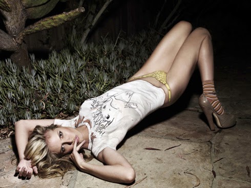
Fashion


Fashion is about setting a trend. Specific colours, types of clothes and patterns are all communicated through the apparel that the model is wearing. Traditional fashion photography is very tame and focuses on the style of clothing. Often it will be in black and white so that the colour doesn't distract the viewer from how its being worn. However the other type is very vibrant and in your face. It thrives on being insane with shapes and colours. Location can really effect the impact of a fashion image. If colours match or contrast it will make parts of the image hide itself but make other areas shine through the rest of the colours or lines. The location might not even match the style of the fashion and give it an odd feel to it.
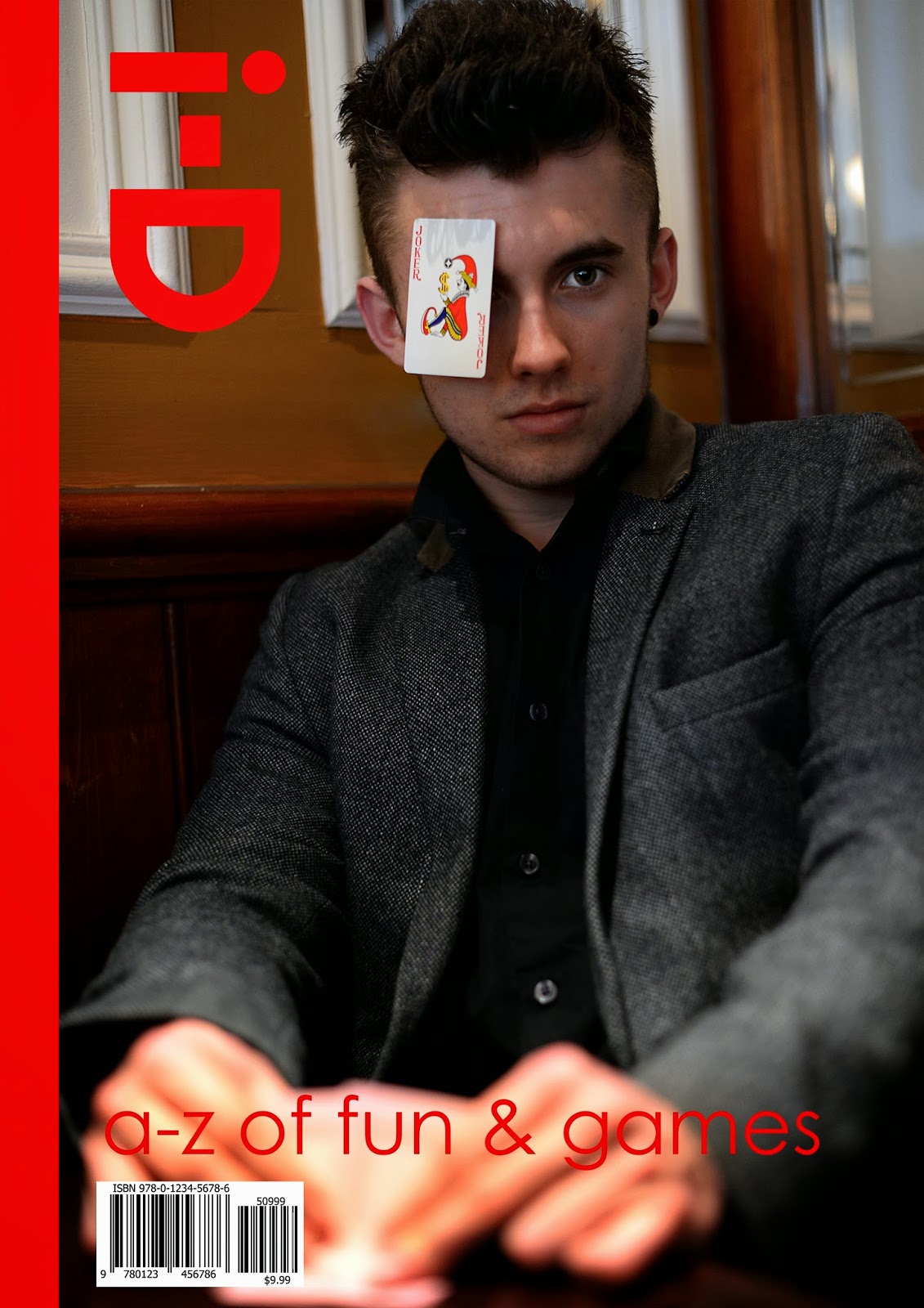
Portraiture


Portraiture is a very broad subject with many angles and perception of it. It can include any and all of the persons body however photographers like Friedlander use shadows to make portraits. Black and white portraits usually convey a more serious or deep feeling about the image because of the tones and use of lighting. The lighting can either be soft or harsh depending on the location of the shoot.
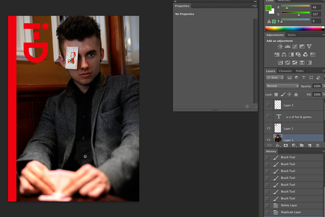
Event


Event photography includes weddings, concerts, parties, award ceremonies, etc. the photographer is primarily there to record and document memorable moments for guests. Often the lighting at events like these are only well lit at specific times. This means that the photographer would have to compensate with a flash gun. They would also have to think about how many people and where they are likely to stand/gather in order to make it easier for them to move around to get into the right position for an image. Some things happen in the blink of an eye, they would have to be constantly vigilant and have a fast shutter speed to capture the moment in absolute detail. The model wont always be looking at the photographer so they will have to think about their shot and take it wisely.