
Edits


Yellow and green dont match the natural tones of the image however the red does. I think I will make the text red as well to make it match.
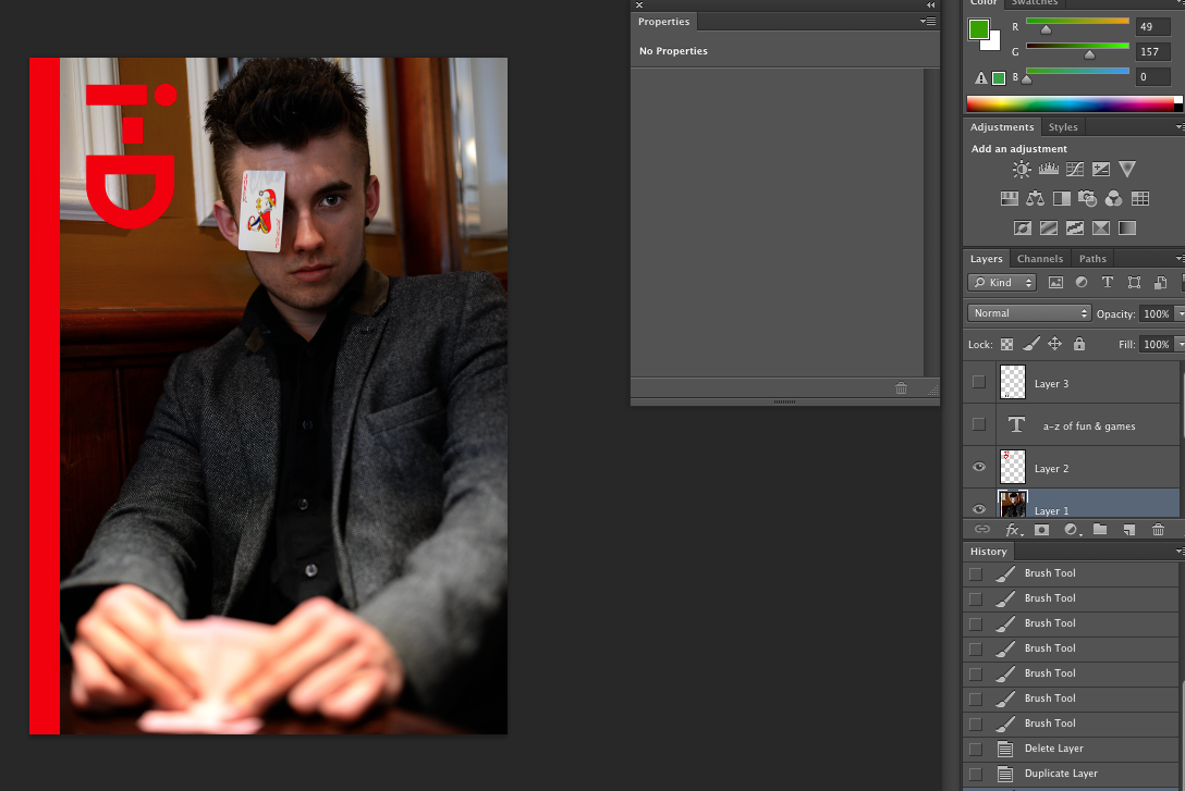


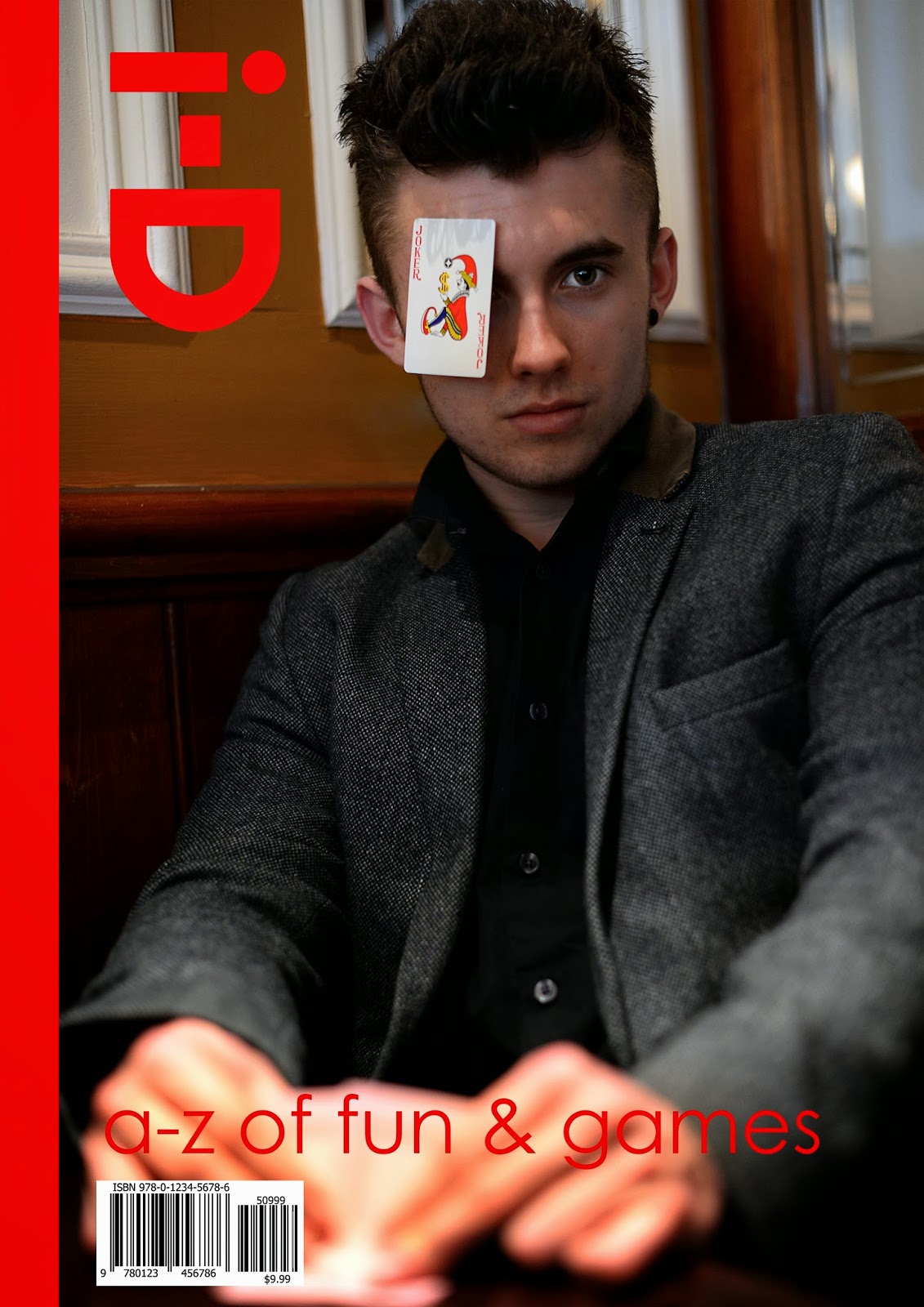
I first started with my chosen image and placed it on an A3 sized template. I think that the models face is too stretched out. I could add a side bar which means I can make the image thinner.
Yellow and green dont match the natural tones of the image however the red does. I think I will make the text red as well to make it match.
I added the red i-D logo.
I added the red text however I think that the text is too curvy because a lot of official covers use straighter edged text.
This one is easier to read and doesn't bleed into the image as much as the previous. It is called Century Gothic.
I then added the barcode and I was finished.
i think i should have used a larger aperture in order to add some detail to the hands because you can only tell that the model is holding cards until you look closely. The card is also slightly off the eye so i would like to move it across to make it cover the eye a little more.
No comments:
Post a Comment